For those of you who follow us on Twitter, you may have read our tweets about traveling to our project in Laughlin. We did just that last week and were SO excited about the progress that has been made. We wanted to share our before and during pictures, and you'll just have to stand by for the after pictures.
Here's what we started with:

Our adorable clients wanted to add on to their home. They wanted to add an office for him, an office for her, a media room, a fancy little powder room and a guest bedroom and bathroom. The husband is an avid hobbyist, so he also wanted to create a "spray" room for painting and a hobby room where he can work on his various projects.
The clients had very few requirements - they wanted the addition to look as if it had been built at the same time as the original home. They also wanted contemporary furnishings and are in love with unique light fixtures. It's exciting for Heather and I because we share very similar tastes with these clients. So let's get on with the photos, right?!
Here's the front - the old garage next to the new entrance:

The front door - still waiting for stain and light fixture

This is her office ceiling - it's going to have a fabulous fixture from Foscarini hanging from the center of it:

That looks like this:


This delicious wallcovering will hang on one wall of her office. Just wait for it!
This is the media room ceiling that we designed:

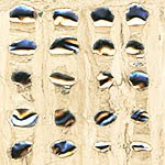
There is lighting inside and each of these will be wrapped with a gorgeous metallic wallcovering that looks like this:

Here is one close up:

These are the cabinets in the media room - they will have a microwave, an icemaker and a refrigerator. They have a beautiful grey finish on top of them - this picture does not do them justice.

Here is the powder room. It is going to have THE most fabulous wallcovering on the other three walls and the ceiling. Wait until you see the lighting and the plumbing fixtures. I DIE!

The mirror

The light fixtures

The back wall is made of glass mosaic tiles. The floor is a beautiful blue/gray marble with some of the glass mosaic tiles dropped in between. Again, much better in person.

We also designed a cut out in the wall that will sit behind the vanity piece to hold extra toilet paper. Since the look is ultra-contemporary, we didn't want to add any extra pieces to hold toilet paper.


The base is also the glass mosaic tile.
Here are images of the spray room:

It has a ton of storage and its own ventilation system so that he can paint (spray) and not worry about poisoning everyone else in the house. The cabinets are a great lacquered white with super cool and modern door hardware.
The hobby room has more of the same cabinetry - and for anyone who loves organization, as Heather and I do, you will drool over the amount of drawers, doors and cabinets available to this guy.


The floor will be a gloss gray epoxy and the countertop underneath the window is made of a material called Alkemi - it is made from fine flake aluminum scraps. When you look closely, you can see small metal shavings within the material.

And now - the guest bedroom. There is not much to see at this point, but we have designed a GORGEOUS headboard with citrine pieces incorporated into the tufting. Here is what it looks like right now:

The bathroom is in the very back of the photo and here are the sconces that will flank the mirror in the bathroom:

Can you see them? They are crushed glass inside a metal cage, from Ridgely Studio Works. We were giddy when we opened this package, and can you blame us?
Here's the shower:


There's so much more - furniture, fabric, window treatments, more wallcovering, flooring - and we can't wait! Seeing it all come together is the most fun for us. What do you guys think?


1 comment:
How exciting!!! I can't wait to see more!
xoxo
Post a Comment